Color Psychology in Office Interiors: Boosting Focus, Calm & Creativity
Color isn’t just visual—it’s emotional, psychological, and deeply strategic. In modern workplaces, the colors you choose aren’t just about aesthetics. They directly influence employee productivity, mood, creativity, and even how clients perceive your brand.
So, what happens when we combine interior design with color psychology? Magic. Or rather, measurable improvement in how people feel and perform.
Let’s explore how color psychology shapes office interior design and how you can use it to build smarter, more inspiring workspaces.
Why Color Psychology Is Crucial in Office Interiors
Every color evokes an emotional response. Some make us feel relaxed and focused. Others energize or inspire. When used intentionally, colors can enhance performance, reduce stress, and create a brand-aligned atmosphere.
In today’s hybrid work era, office design has a new mission: boost human performance while reflecting company culture. Color is one of the most affordable and impactful ways to do just that.
Psychological Effects of Colors in the Workplace
Let’s decode the meaning behind popular office colors:
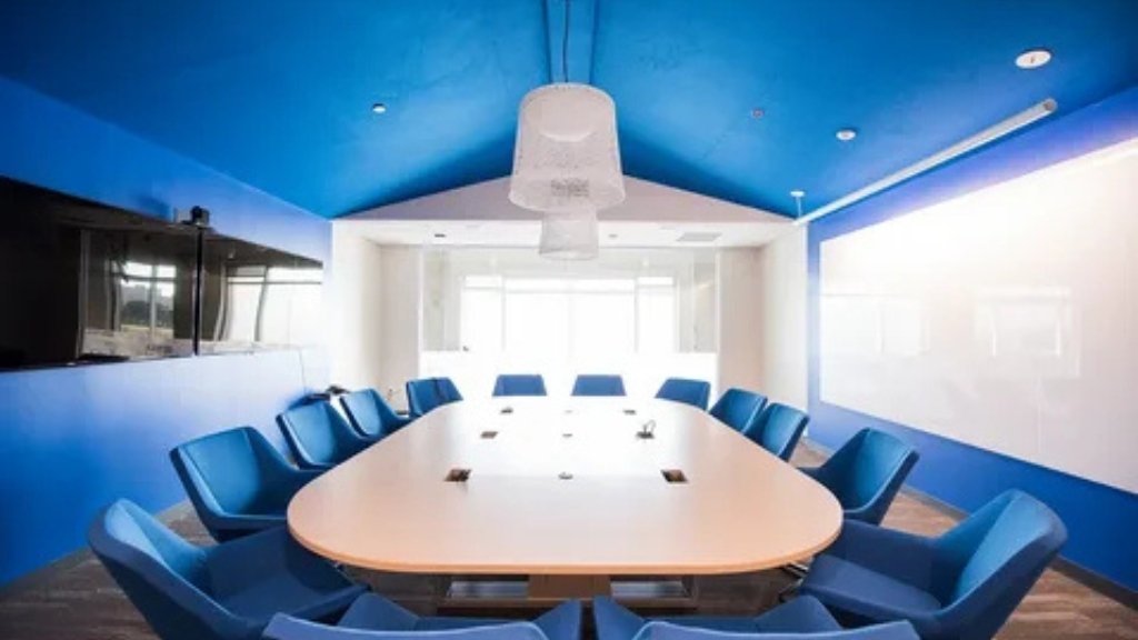
- Blue: Calming, trustworthy, and great for concentration. Ideal for tech firms, finance departments, and corporate offices.
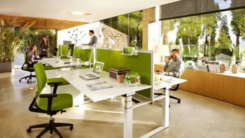
- Green: Balanced and restful. Reduces eye strain, making it perfect for long work hours or workstations
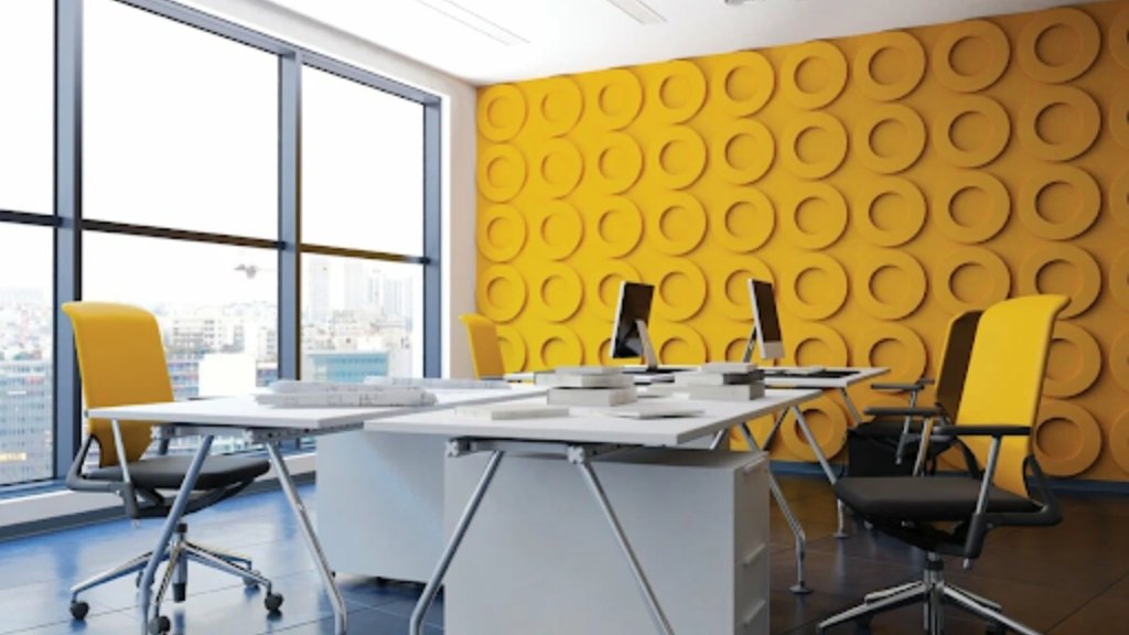
- Yellow: Stimulates creativity and optimism. Works best in collaborative areas, design studios, or ideation rooms.
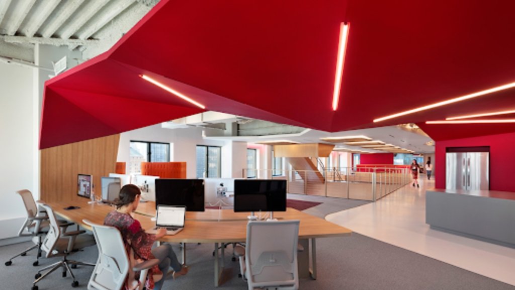
- Red: Energetic, intense, and best used sparingly. Suitable for sales zones, cafeterias, or emergency exits.
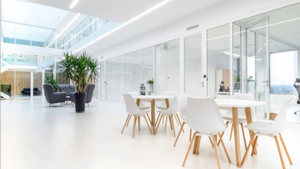
- White: Clean and minimal. Makes spaces feel larger but can also feel sterile if overused.
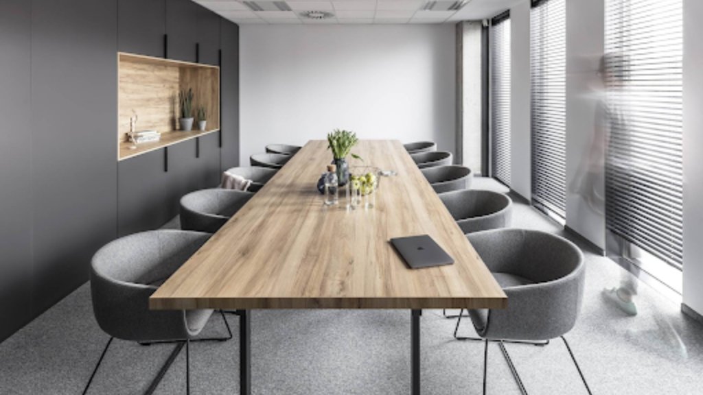
- Grey: Professional and neutral. Often used in executive cabins and meeting rooms for its understated elegance.
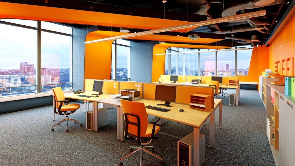
- Orange: Friendly and inviting. Encourages conversation and warmth—ideal for lounges or breakout zones.
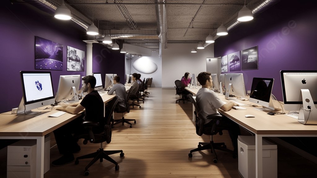
- Purple: Creative and introspective. Great for wellness rooms or creative businesses.
- Black: Sophisticated and grounding. Use as an accent in reception areas or branding walls.
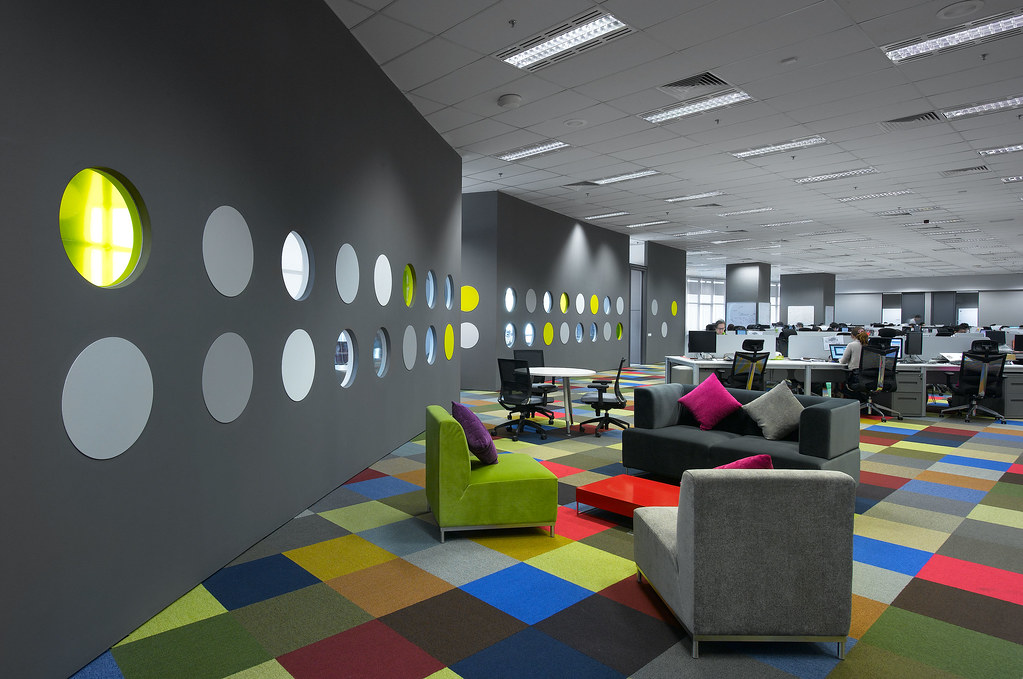
Color Zoning: Designing by Function, Not Just Style
One of the smartest ways to apply color psychology in office interiors is through color zoning—assigning colors to different functional areas.
Here’s how that looks in practice:
- Reception areas: Warm neutrals and earthy tones feel welcoming and grounded.
- Workstations: Soft blues and greens support long focus sessions without overstimulating.
- Meeting rooms: Mix blues (for calm) with a pop of yellow (for brainstorming).
- Creative zones: Think bold—corals, teal, or electric yellow to stimulate imagination.
- Quiet rooms or nap pods: Soft purples and muted greens to calm the mind.
When done right, color zoning helps people subconsciously shift their mindset based on their physical location within the office.
Aligning Colors with Brand Identity
Your brand identity shouldn’t stop at your logo. It should flow through your workspace, from the lobby to the boardroom. Using your brand palette within the interiors:
- Reinforces culture and values
- Improves internal brand recall
- Creates a cohesive client experience
For example:
- Startups often opt for vibrant hues like orange or turquoise to signal agility.
- Corporate firms prefer blue or grey for trust and professionalism.
- Creative agencies embrace eclectic and unconventional color pairings.
Office interiors are now an extension of your brand story. Make it speak loud and clear—with color.
Cultural Sensitivity in Color Choices
Designing for a global team? Be aware: color meanings vary across cultures.
- Red is festive in China but can feel aggressive in Western contexts.
- White symbolizes mourning in parts of Asia but is considered modern and pure in Western design.
- Green is considered lucky in some countries, while in others, it’s linked to jealousy.
If you have a multicultural team or international clientele, make sure your color scheme doesn’t unintentionally alienate or offend.
Lighting and Material Finish: Color’s Silent Partners
Colors don’t live in a vacuum. Their impact changes based on lighting and material choices.
- Natural light amplifies warm tones and brightens up neutral palettes.
- Cool artificial lighting pairs well with greys, blues, and white-based themes.
- Glossy finishes feel energetic and high-tech, while matte textures feel calm and grounded.
- Wood, stone, and biophilic materials paired with earthy greens can lower stress levels.
Together, they create a complete sensory experience that enhances the psychological effect of your color palette.
Tailoring Colors for Different Teams and Functions
A one-size-fits-all approach never works in workplace design. Here’s how to customize colors by team function:
- Tech or coding teams: Muted tones like grey-blue for deep focus.
- Sales floors: Use red or orange accents to boost urgency and enthusiasm.
- HR and admin: Neutral shades for calmness and trust.
- Design or content teams: Bright tones like canary yellow or lavender to spark creativity.
- Leadership cabins: Deep greys or navy to evoke authority without overpowering.
Color psychology in interior design is all about balance—using the right amount of stimulation and calm, based on the job at hand.
Avoid These Common Office Color Mistakes
Even with the best intentions, bad color choices can hurt your office vibe. Avoid:
- Overusing white – it can feel cold and clinical.
- Too many bright colors – they become distracting and cause visual fatigue.
- Ignoring team feedback – employees spend 8+ hours in that space. Their comfort matters.
- Following trends blindly – what’s “in” might not work for your culture or work style.
Always test your palette under real lighting conditions before painting the full wall.
Combine Color Psychology with Eco-Friendly Design
Want to take your office interiors to the next level?
Combine color psychology with eco-friendly office interiors. Use nature-inspired tones—forest green, sky blue, terracotta—and pair them with:
- Indoor plants
- Sustainable materials
- Natural lighting
This approach not only promotes mental well-being but also supports environmental responsibility, making your office both conscious and creative—explore more in our guide on Eco-Friendly Interior Design Ideas for Office Spaces.
Final Thoughts
The best office interiors don’t just look good. They feel good.
By leveraging color psychology, you’re designing not just with paint, but with purpose. Every wall, accent, and texture contributes to how people work, think, and connect in your space.
Whether you’re building a focused tech den, a high-energy sales floor, or a serene brainstorming lounge, let color guide your vision.
Ready to bring color psychology into your office interiors?
Partner with Dreamspace, your trusted commercial interior design firm, to create workspaces that don’t just look good, but work better for your people.