Colour can influence mood, productivity, culture, and connectivity – it can make or break your design.
The right office colour schemes can also make a statement about a brand’s image – the mood it seeks to inspire it its customers, the energy it seeks to ignite in its staff, and the zones that support a variety of functions and flow within its space. Colour synchronised with texture is perhaps the most influential and powerful element of commercial interior design.
But power doesn’t necessarily mean dominance. Subtle bursts of colour can transform a neutral canvas into a high-energy hub, a contemplative nook, or a social space for networking or collaborating with co-workers. Colour can lift, ground, ease, or inspire a workforce.
The Color Effect
Blue
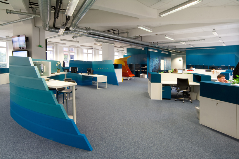
The vibe: Calming, promotes trust, communication and focus.
Ideal in: Spaces where head down work is needed.
Yellow
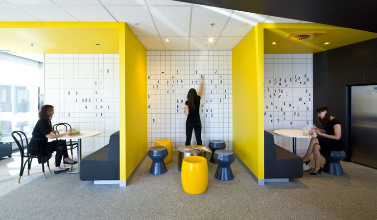
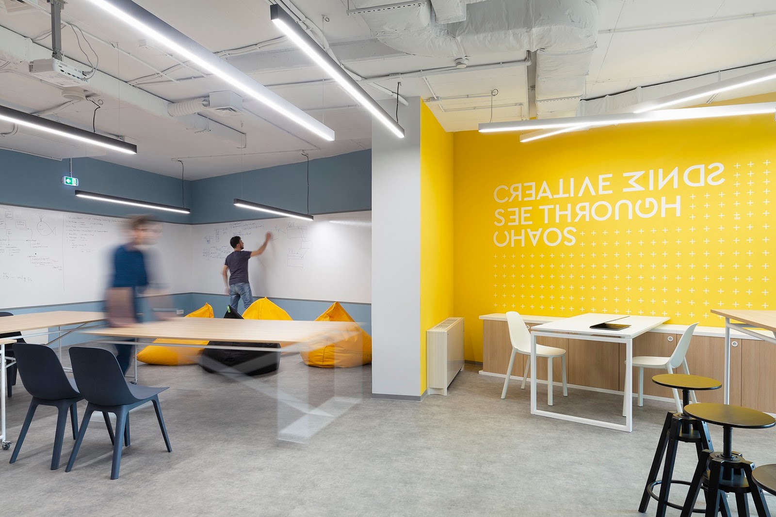
The vibe: Optimistic, stimulates the spirit and promotes innovation.
Ideal in: Spaces where creativity is needed.
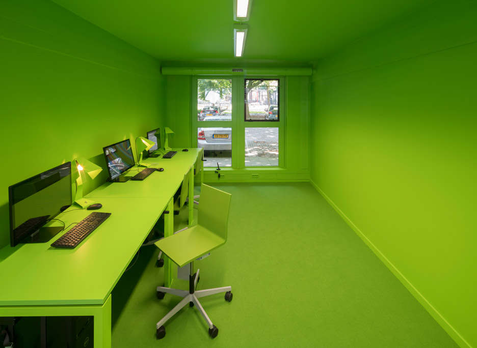
Green
The vibe: Also calming, promotes balance, confidence and efficiency.
Ideal in: Spaces where you brainstorm and/or where employees are working for long periods of time as it does not cause eye fatigue.
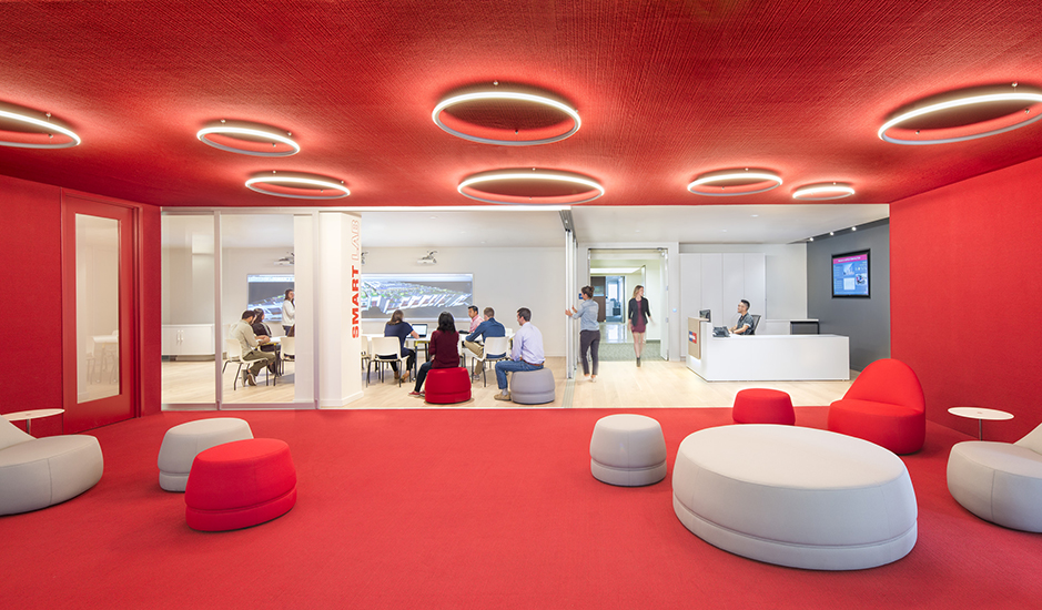
Red
The vibe: Stimulating, active, passionate and intense.
Ideal in: Spaces where detail-oriented tasks are performed or tasks that require memory retrieval and/or physical activity as it increases heart rate and blood flow. Also great in areas where you want to draw attention
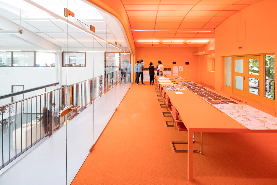
Orange
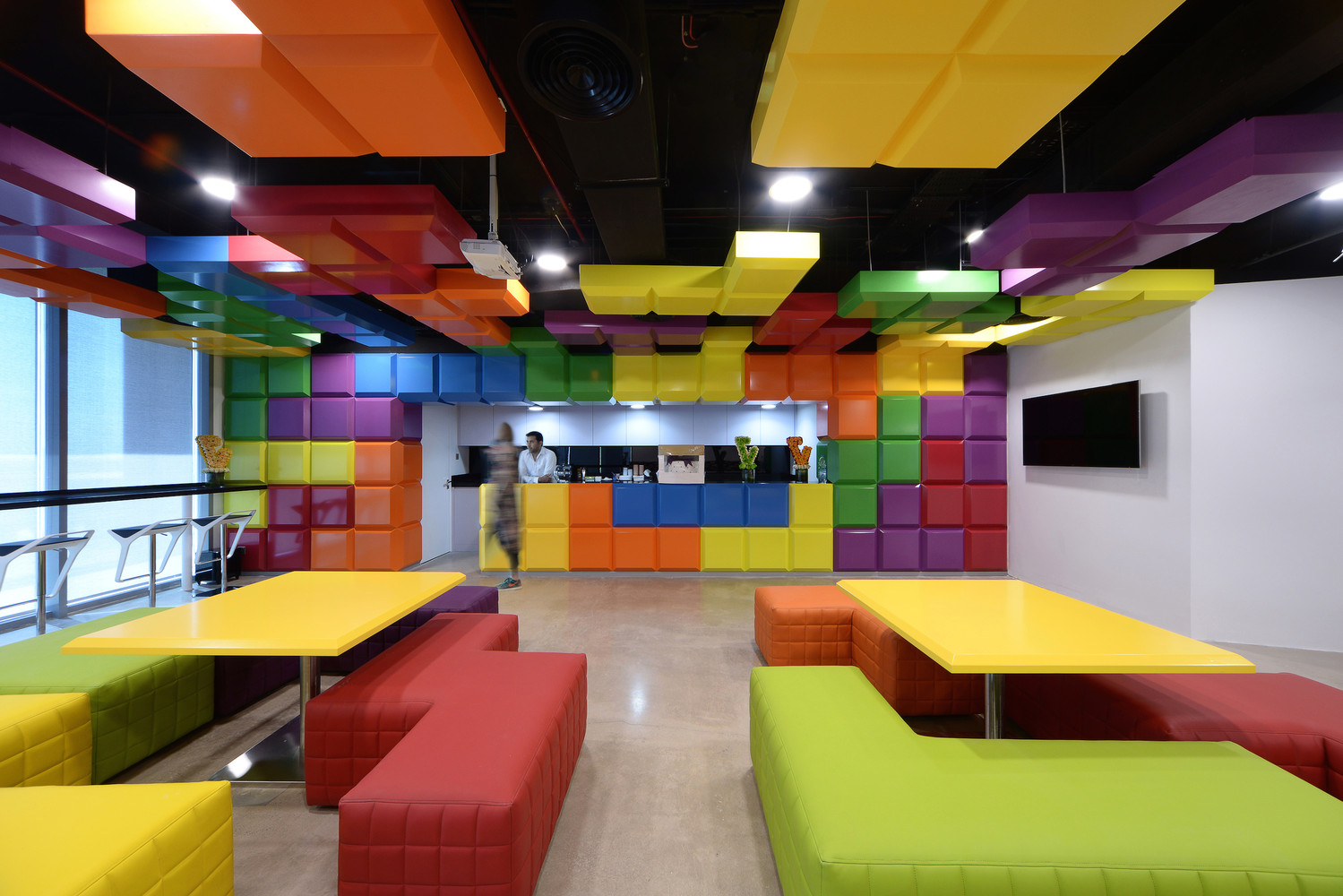
The vibe: Cheerful and energetic, playful color with a lot of warmth
Ideal in: Spaces where you’re encouraging employee interaction and engagement such as office break rooms.
Commercial Office Color Scheme Considerations
Keep in mind that there’s no wrong color to use in an office, it’s more about how you use it with considerations such as:
The Where – It’s not just the vibe of the color, it must make sense for the work being done. For example, conference rooms, reception and HR spaces may need different color schemes.
The Who – Make sure to consider who will be working in the space. For example, studies have shown that gray, beige and white offices may create feelings of sadness and depression, especially in women, while men may experience these feelings in purple and orange workspaces.
The Who Part Deux – If you have clients visit your office, color use is a way that you can bring your culture and brand into the space so consider what message and feel you want to convey to them as well.
The How – There’s more to a color than the color itself so to speak. By that we mean, don’t rule out a color because it’s too bright, for example. You can always adjust the saturation until the color is the ideal hue for the space.



Nice Post! Thanks for sharing such an amazing article, really informative,it helps me a lot. Are you looking for a Top interior designers in Hyderabad then please visit: Top interior designers in Hyderabad